
Two Abandoned Trolleys, Nick Tierney, Film, Olympus XA
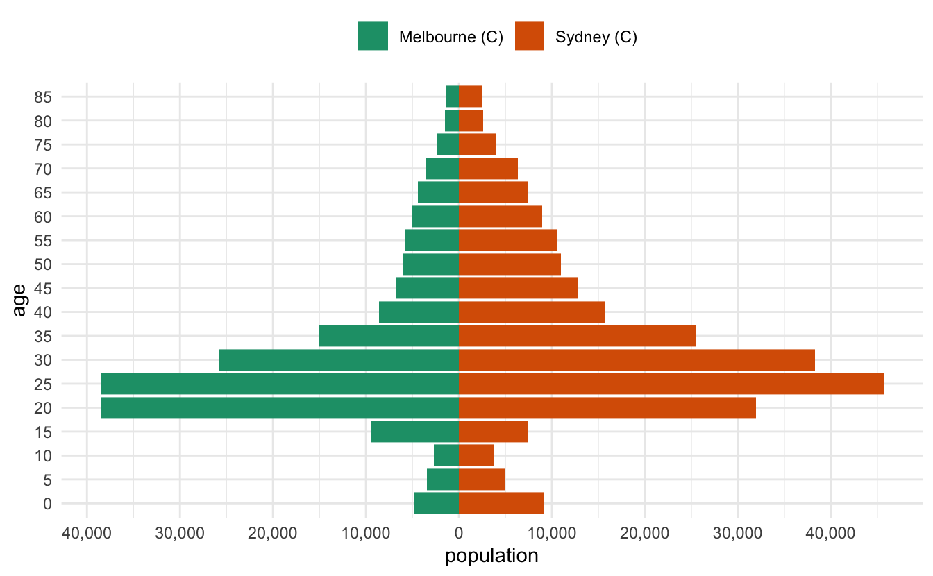
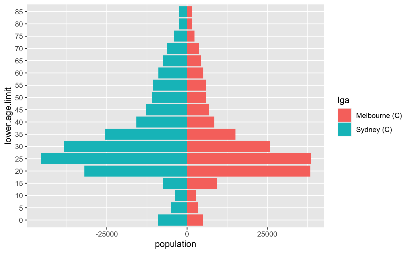
I recently had to make some pyramid plots in R. They are a useful way to compare age structures of populations. They look like this:
It’s been a while since I had to make them, and in the past I’ve cooked them up in a relatively bespoke way. This time I needed to be able to have some level of programming to them - I wanted to be able to provide any two LGAs in Australia and then make a pyramid plot of them that looked nice.
I started by looking at this SO thread - overall this gave me what I wanted, but I thought I’d walk through my solution, as it is a little different, and might hopefully be useful to others.
The data
The data is comes from the Australian Bureau of Statistics, which is then cleaned up, and packaged in the conmat R package, which I maintain. Before I show that, I’ll load the packages I need, tidyverse , and conmat:
library(tidyverse)#> ── Attaching packages ───────────────────────────── tidyverse 1.3.1 ──#> ✔ ggplot2 3.3.6     ✔ purrr   0.3.4
#> ✔ tibble  3.1.7     ✔ dplyr   1.0.9
#> ✔ tidyr   1.2.0     ✔ stringr 1.4.0
#> ✔ readr   2.1.2     ✔ forcats 0.5.1#> ── Conflicts ──────────────────────────────── tidyverse_conflicts() ──
#> ✖ dplyr::filter() masks stats::filter()
#> ✖ dplyr::lag()    masks stats::lag()library(conmat)#> Warning: package 'conmat' was built under R version 4.2.1
You can access the age structured population for a given LGA like so:
# |label: LGA-hobart
abs_age_lga("Hobart (C)")#> # A tibble: 18 × 4
#>    lga        lower.age.limit  year population
#>    <chr>                <dbl> <dbl>      <dbl>
#>  1 Hobart (C)               0  2020       2442
#>  2 Hobart (C)               5  2020       2833
#>  3 Hobart (C)              10  2020       2771
#>  4 Hobart (C)              15  2020       3038
#>  5 Hobart (C)              20  2020       4982
#>  6 Hobart (C)              25  2020       5132
#>  7 Hobart (C)              30  2020       4196
#>  8 Hobart (C)              35  2020       3510
#>  9 Hobart (C)              40  2020       3214
#> 10 Hobart (C)              45  2020       3428
#> 11 Hobart (C)              50  2020       3202
#> 12 Hobart (C)              55  2020       3381
#> 13 Hobart (C)              60  2020       3291
#> 14 Hobart (C)              65  2020       3036
#> 15 Hobart (C)              70  2020       2512
#> 16 Hobart (C)              75  2020       1721
#> 17 Hobart (C)              80  2020       1189
#> 18 Hobart (C)              85  2020       1372
In our case, we want to combine two LGAs and compare them. So let’s write a little helper function, two_abs_age_lga:
two_abs_age_lga <- function(lga_1, lga_2){
  bind_rows(
    abs_age_lga(lga_1),
    abs_age_lga(lga_2)
  )
}
So now we can get say, Melbourne and Sydney, like so:
melb_syd <- two_abs_age_lga("Melbourne (C)", "Sydney (C)")
melb_syd#> # A tibble: 36 × 4
#>    lga           lower.age.limit  year population
#>    <chr>                   <dbl> <dbl>      <dbl>
#>  1 Melbourne (C)               0  2020       4882
#>  2 Melbourne (C)               5  2020       3450
#>  3 Melbourne (C)              10  2020       2675
#>  4 Melbourne (C)              15  2020       9396
#>  5 Melbourne (C)              20  2020      38434
#>  6 Melbourne (C)              25  2020      38546
#>  7 Melbourne (C)              30  2020      25834
#>  8 Melbourne (C)              35  2020      15072
#>  9 Melbourne (C)              40  2020       8554
#> 10 Melbourne (C)              45  2020       6753
#> # … with 26 more rowstail(melb_syd)#> # A tibble: 6 × 4
#>   lga        lower.age.limit  year population
#>   <chr>                <dbl> <dbl>      <dbl>
#> 1 Sydney (C)              60  2020       8950
#> 2 Sydney (C)              65  2020       7377
#> 3 Sydney (C)              70  2020       6308
#> 4 Sydney (C)              75  2020       4002
#> 5 Sydney (C)              80  2020       2583
#> 6 Sydney (C)              85  2020       2506
The data wrangling
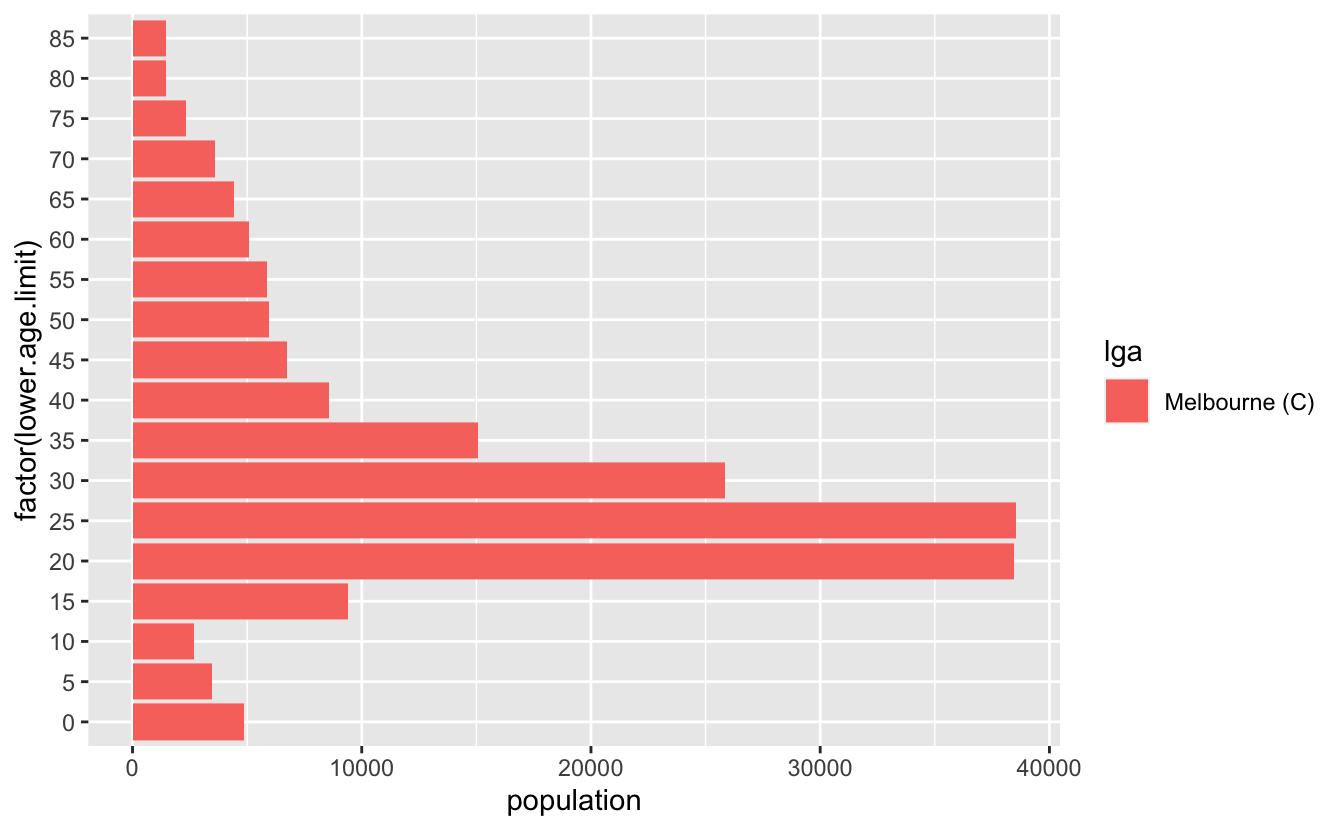
Now, to get the data into this plot, what we want is a plot of the population against each age group. To illustrate this I’ll just use Melbourne data:
melb <- abs_age_lga("Melbourne (C)")
ggplot(melb,
       aes(x = population,
           y = lower.age.limit,
           fill = lga)) +
  geom_col()
Ack, we need the y variable to be a factor
But what we actually want are two plots, one going the other way for the other group. We can make this happen by making the population negative:
syd <- abs_age_lga("Sydney (C)")
ggplot(syd,
       aes(x = -population,
           y = factor(lower.age.limit),
           fill = lga)) +
  geom_col()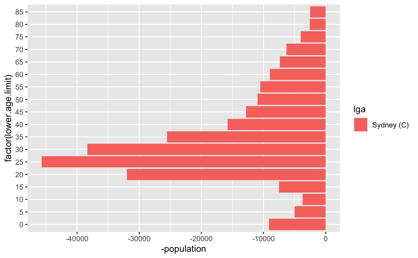
And then we want to combine those two plots - so we can write something bespoke, like this. Let’s also make that age limit data a factor while we are here
melb_syd_pyramid <- melb_syd %>%
  mutate(
    population = case_when(
      lga == "Sydney (C)" ~ -population,
      TRUE ~ population
    ),
    lower.age.limit = as_factor(lower.age.limit)
  )

melb_syd_pyramid#> # A tibble: 36 × 4
#>    lga           lower.age.limit  year population
#>    <chr>         <fct>           <dbl>      <dbl>
#>  1 Melbourne (C) 0                2020       4882
#>  2 Melbourne (C) 5                2020       3450
#>  3 Melbourne (C) 10               2020       2675
#>  4 Melbourne (C) 15               2020       9396
#>  5 Melbourne (C) 20               2020      38434
#>  6 Melbourne (C) 25               2020      38546
#>  7 Melbourne (C) 30               2020      25834
#>  8 Melbourne (C) 35               2020      15072
#>  9 Melbourne (C) 40               2020       8554
#> 10 Melbourne (C) 45               2020       6753
#> # … with 26 more rows
So now we can get this:
And that’s pretty good!
Let’s tidy it up a little bit - we want to change the axis on the bottom to be positive in both directions, so we’ll need to specify the break points for the axis marks, as well as the labels. So we want a sequence from one end to the other, but for it to be symmetric. Let’s start by getting the range, by using the range function:
pop_range <- range(melb_syd_pyramid$population)
pop_range#> [1] -45686 38546Now we want a sequence from there to the end value. We can use seq to make a sequence
pop_range_seq <- seq(pop_range[1], pop_range[2], by = 15000)
pop_range_seq#> [1] -45686 -30686 -15686 -686 14314 29314Briefly, what we want to do is something like this:
ggplot(melb_syd_pyramid,
         aes(x = population,
             y = lower.age.limit,
             fill = lga)) +
geom_col() +
scale_x_continuous(breaks = pop_range_seq,
labels = abs(pop_range_seq))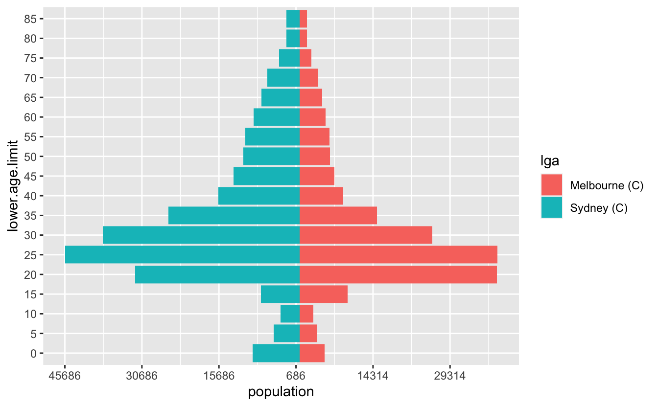
Ugh, but the numbers aren’t very nice. We want some nicer numbers. We can use a negative number in round to give us something slightly better.
round(pop_range, -2)#> [1] -45700 38500But I’d like to round to the nearest 500…and we also need to have a 0 in there as well.
base::pretty()
Turns out this is a pretty common thing to do, and base R has us covered, with pretty()! It even includes 0!
pretty(pop_range)#> [1] -60000 -40000 -20000 0 20000 40000There are loads of options, but we’ll just specify n to change the number of breaks
pop_range_breaks <- pretty(pop_range, n = 7)So now we have something that looks pretty good
ggplot(melb_syd_pyramid,
         aes(x = population,
             y = lower.age.limit,
             fill = lga)) +
    geom_col() +
    scale_x_continuous(breaks  = pop_range_breaks,
                       labels = abs(pop_range_breaks))
OK, but a few more gripes:
-
The numbers are a bit hard to read - we can add a comma into them to improve that with
scales::comma -
the legend needs to be on top
-
The colour scale should be colourblind friendly
scales::comma()
A really cool function! It takes number input and adds commas into them.
scales::comma(10)#> [1] "10"scales::comma(100)#> [1] "100"scales::comma(1000)#> [1] "1,000"scales::comma(1000000)#> [1] "1,000,000"Let’s add that in, along with the changes to the legend, as well as an improved colour scale
ggplot(melb_syd_pyramid,
         aes(x = population,
             y = lower.age.limit,
             fill = lga)) +
    geom_col() +
    scale_x_continuous(breaks  = pop_range_breaks,
                       labels = scales::comma(abs(pop_range_breaks))) +
  scale_fill_brewer(palette = "Dark2") +
  theme_minimal() +
theme(legend.position = "top") 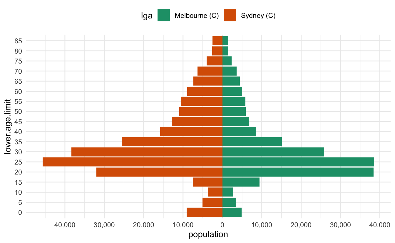
This doesn’t generalise to other data
Unfortunately, if I want to do this to another dataset, which doesn’t have Sydney and Melbourne, I’ll need to write custom code each time. We can do a little better, let’s write this as a function, which takes two inputs, the name of each of the LGAs we want to explore.
This involves a few steps - first, we need to modify the data as we’ve done above. Let’s call this a prep_pop_pyramid function. First let’s scratch out what it will do.
So we need to get the data.
melb_syd <- two_abs_age_lga("Melbourne (C)", "Sydney (C)")Then we need to multiply one of the populations by -1, so that we get the reflected population in the other direction. We had previously done:
melb_syd %>%
  mutate(
    population = case_when(
      lga == "Sydney (C)" ~ -population,
      TRUE ~ population
    )
  )#> # A tibble: 36 × 4
#>    lga           lower.age.limit  year population
#>    <chr>                   <dbl> <dbl>      <dbl>
#>  1 Melbourne (C)               0  2020       4882
#>  2 Melbourne (C)               5  2020       3450
#>  3 Melbourne (C)              10  2020       2675
#>  4 Melbourne (C)              15  2020       9396
#>  5 Melbourne (C)              20  2020      38434
#>  6 Melbourne (C)              25  2020      38546
#>  7 Melbourne (C)              30  2020      25834
#>  8 Melbourne (C)              35  2020      15072
#>  9 Melbourne (C)              40  2020       8554
#> 10 Melbourne (C)              45  2020       6753
#> # … with 26 more rows
But this will not generalise to any two LGA names. So instead we can assign one of the LGAs to a number, which we can do by first grouping by lga, then using cur_group_id(), to label the groups as a number.
melb_syd %>%
    group_by(lga) %>%
    mutate(
      age_multiplier = cur_group_id(),
      .after = lga
    )#> # A tibble: 36 × 5
#> # Groups:   lga [2]
#>    lga           age_multiplier lower.age.limit  year population
#>    <chr>                  <int>           <dbl> <dbl>      <dbl>
#>  1 Melbourne (C)              1               0  2020       4882
#>  2 Melbourne (C)              1               5  2020       3450
#>  3 Melbourne (C)              1              10  2020       2675
#>  4 Melbourne (C)              1              15  2020       9396
#>  5 Melbourne (C)              1              20  2020      38434
#>  6 Melbourne (C)              1              25  2020      38546
#>  7 Melbourne (C)              1              30  2020      25834
#>  8 Melbourne (C)              1              35  2020      15072
#>  9 Melbourne (C)              1              40  2020       8554
#> 10 Melbourne (C)              1              45  2020       6753
#> # … with 26 more rows
This then gives us a 1 or a 2. We can then set this to be negative if it is the second group.
melb_syd %>%
    group_by(lga) %>%
    mutate(
      age_multiplier = cur_group_id(),
      age_multiplier = case_when(age_multiplier == 2 ~ 1,
                                 TRUE ~ -1),
      .after = lga
    ) #> # A tibble: 36 × 5
#> # Groups:   lga [2]
#>    lga           age_multiplier lower.age.limit  year population
#>    <chr>                  <dbl>           <dbl> <dbl>      <dbl>
#>  1 Melbourne (C)             -1               0  2020       4882
#>  2 Melbourne (C)             -1               5  2020       3450
#>  3 Melbourne (C)             -1              10  2020       2675
#>  4 Melbourne (C)             -1              15  2020       9396
#>  5 Melbourne (C)             -1              20  2020      38434
#>  6 Melbourne (C)             -1              25  2020      38546
#>  7 Melbourne (C)             -1              30  2020      25834
#>  8 Melbourne (C)             -1              35  2020      15072
#>  9 Melbourne (C)             -1              40  2020       8554
#> 10 Melbourne (C)             -1              45  2020       6753
#> # … with 26 more rows
Then, we have something that we can use to multiply the population by -1 ! Let’s also take this chance to turn age into a factor.
melb_syd %>%
    group_by(lga) %>%
    mutate(
      age_multiplier = cur_group_id(),
      age_multiplier = case_when(age_multiplier == 2 ~ 1,
                                 TRUE ~ -1),
      .after = lga
    ) %>%
    ungroup() %>%
    mutate(age = as_factor(lower.age.limit),
           population = population * age_multiplier)#> # A tibble: 36 × 6
#>    lga           age_multiplier lower.age.limit  year population age
#>    <chr>                  <dbl>           <dbl> <dbl>      <dbl> <fct>
#>  1 Melbourne (C)             -1               0  2020      -4882 0
#>  2 Melbourne (C)             -1               5  2020      -3450 5
#>  3 Melbourne (C)             -1              10  2020      -2675 10
#>  4 Melbourne (C)             -1              15  2020      -9396 15
#>  5 Melbourne (C)             -1              20  2020     -38434 20
#>  6 Melbourne (C)             -1              25  2020     -38546 25
#>  7 Melbourne (C)             -1              30  2020     -25834 30
#>  8 Melbourne (C)             -1              35  2020     -15072 35
#>  9 Melbourne (C)             -1              40  2020      -8554 40
#> 10 Melbourne (C)             -1              45  2020      -6753 45
#> # … with 26 more rows
And then let’s wrap this into a function:
prep_pop_pyramid <- function(data){
  data %>%
    group_by(lga) %>%
    mutate(
      age_multiplier = cur_group_id(),
      age_multiplier = case_when(age_multiplier == 2 ~ 1,
                                 TRUE ~ -1),
      .after = lga
    ) %>%
    ungroup() %>%
    mutate(age = as_factor(lower.age.limit),
           population = population * age_multiplier)
}
OK so now let’s put those two parts together:
melb_syd <- two_abs_age_lga(
  "Melbourne (C)",
  "Sydney (C)"
) %>%
  prep_pop_pyramid()

melb_syd#> # A tibble: 36 × 6
#>    lga           age_multiplier lower.age.limit  year population age
#>    <chr>                  <dbl>           <dbl> <dbl>      <dbl> <fct>
#>  1 Melbourne (C)             -1               0  2020      -4882 0
#>  2 Melbourne (C)             -1               5  2020      -3450 5
#>  3 Melbourne (C)             -1              10  2020      -2675 10
#>  4 Melbourne (C)             -1              15  2020      -9396 15
#>  5 Melbourne (C)             -1              20  2020     -38434 20
#>  6 Melbourne (C)             -1              25  2020     -38546 25
#>  7 Melbourne (C)             -1              30  2020     -25834 30
#>  8 Melbourne (C)             -1              35  2020     -15072 35
#>  9 Melbourne (C)             -1              40  2020      -8554 40
#> 10 Melbourne (C)             -1              45  2020      -6753 45
#> # … with 26 more rows
And now let’s wrap the plotting code into a function:
plot_pop_pyramid <- function(data){
  pop_range <- range(data$population)

  age_range_seq <- pretty(pop_range, n = 10)

  ggplot(data,
         aes(x = population,
             y = age,
             fill = lga)) +
    geom_col() +
    scale_x_continuous(breaks  = age_range_seq,
                       labels = scales::comma(abs(age_range_seq))) +
    scale_fill_brewer(palette = "Dark2",
                      guide = guide_legend(
                        title = ""
                      )) +
    theme_minimal() +
    theme(legend.position = "top")
}plot_pop_pyramid(melb_syd)
End
And that was the end of this blog post. But something about the plots kind of bothered me…
Bonus - centering
Well, there’s actually one final step here that you might be interested in - which is centering the “0” of the population. Perhaps there is another way around this, but the approach that I ended up doing was the following:
pretty_symmetric <- function(range, n = 5){
  range_1 <- c(-range[1], range[2])
  range_2 <- c(range[1], -range[2])

  pretty_vec_1 <- pretty(range_1)
  pretty_vec_2 <- pretty(range_2)

  pretty(
    c(pretty_vec_1, pretty_vec_2),
    n = n
  )

}

pretty_symmetric(c(-5000, 10000))#> [1] -10000  -5000      0   5000  10000
So then we replace pretty, with pretty_symmetric , and then need to add this other bit, expand_limits which ensures the limits are kept
plot_pop_pyramid <- function(data){
  pop_range <- range(data$population)

  age_range_seq <- pretty_symmetric(pop_range, n = 5)

  ggplot(data,
         aes(x = population,
             y = age,
             fill = lga)) +
    geom_col() +
    scale_x_continuous(breaks  = age_range_seq,
                       labels = scales::comma(abs(age_range_seq))) +
    expand_limits(x = range(age_range_seq)) +
    scale_fill_brewer(palette = "Dark2",
                      guide = guide_legend(
                        title = ""
                      )) +
    theme_minimal() +
    theme(legend.position = "top")
}plot_pop_pyramid(melb_syd)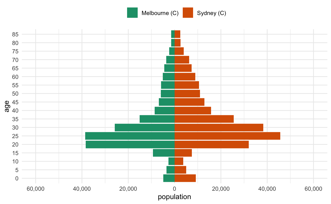
This has a nice benefit of facilitating stacking the plots with something like patchwork and the 0s will be aligned.
melb_syd <- two_abs_age_lga(
  "Melbourne (C)",
  "Sydney (C)"
)

bris_hobart <- two_abs_age_lga(
  "Brisbane (C)",
  "Hobart (C)"
)
alice_perth <- two_abs_age_lga(
  "Alice Springs (T)",
  "Perth (C)"
)
Then we can stack them together with patchwork
library(patchwork)
melb_syd %>% prep_pop_pyramid() %>% plot_pop_pyramid() /
bris_hobart %>% prep_pop_pyramid() %>% plot_pop_pyramid() /
alice_perth %>% prep_pop_pyramid() %>% plot_pop_pyramid()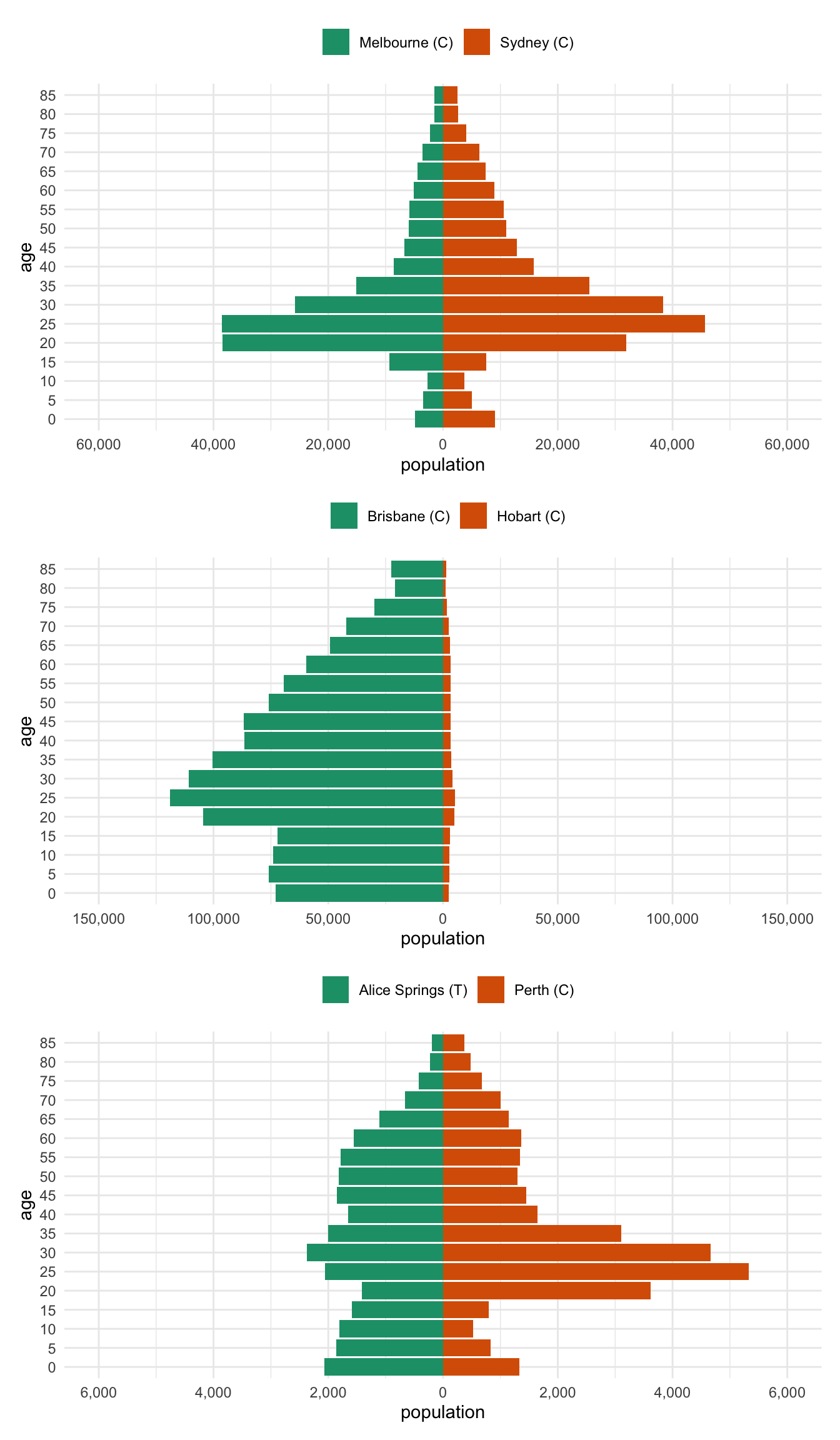
Bonus Bonus - per capita
Ugh. OK. These plots are nice, but really, these should be normalised by the total population.
What does that mean? Why would we want to do that? Well, if you have two cities, one with HEAPS of people, and other with 1000 times less people - the numbers are going to be harder to compare. And if the point you are trying to convey is:
Hey, these two cities have very different population sizes
Then we’ve done that above.
But what we actually kind of care about the most is:
Hey, do these two cities have similar age distributions?
So like, do they have the same proportion of 20-somethings in both cities? Regardless of the fact that one city has like 100 or 1000 times more people?
So, we should fix it.
Where do we fix it? We need to change the data creation function. Adding a new column, population_per_capita, with something like this:
mutate(population_per_capita = population / sum(population))
Which divides the population by the total population. This is sometimes called “normalising”. Effectively, we are comparing each age population to the total population.
Also importantly, we need to do this still in the group_by(lga) below
prep_pop_pyramid <- function(data) {
  data %>%
    group_by(lga) %>%
    mutate(
      age_multiplier = cur_group_id(),
      age_multiplier = case_when(
        age_multiplier == 2 ~ 1,
        TRUE ~ -1
      ),
      .after = lga
    ) %>%
    mutate(population_per_capita = population / sum(population)) %>%
    ungroup() %>%
    mutate(
      age = as_factor(lower.age.limit),
      population = population * age_multiplier,
      population_per_capita = population_per_capita * age_multiplier
    )
}
And since we’ve changed the data that we are using now - we aren’t using population anymore, and I hard coded the plotting code, we need to re-write the function. Perhaps with the benefit of hindsight it would have been better to not hard code variables in the plotting function, but here we are.
plot_pop_pyramid_per_capita <- function(data) {
  pop_range <- range(data$population_per_capita)

  age_range_seq <- pretty_symmetric(pop_range, n = 5)

  ggplot(
    data,
    aes(
      x = population_per_capita,
      y = age,
      fill = lga
    )
  ) +
    geom_col() +
    scale_x_continuous(
      breaks = age_range_seq,
      labels = abs(age_range_seq)
    ) +
    expand_limits(x = range(age_range_seq)) +
    scale_fill_brewer(
      palette = "Dark2",
      guide = guide_legend(
        title = ""
      )
    ) +
    theme_minimal() +
    theme(legend.position = "top")
}
All together now
melb_syd %>% prep_pop_pyramid() %>% plot_pop_pyramid_per_capita() /
bris_hobart %>% prep_pop_pyramid() %>% plot_pop_pyramid_per_capita() /
alice_perth %>% prep_pop_pyramid() %>% plot_pop_pyramid_per_capita()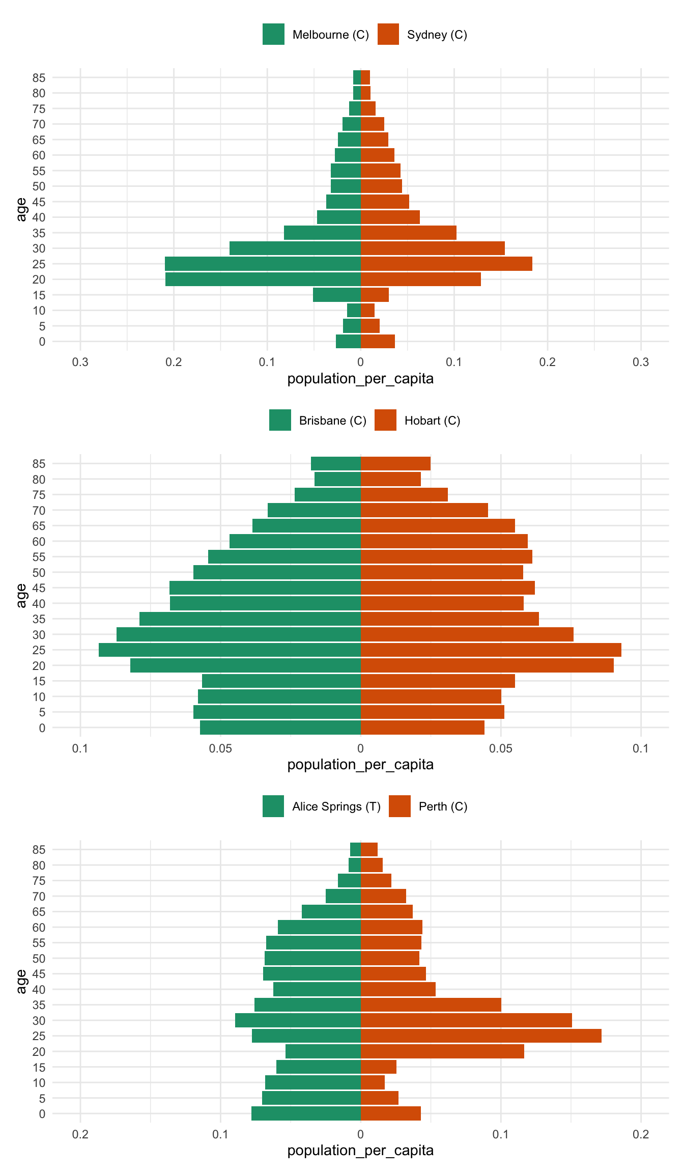
And now for comparison to drive home the difference between the per capita pyramid and the raw population pyramid - most notably, there is a huge difference between brisbane and hobart - previously the population numbers in Brisbane drowned out the differnces in Hobart
bris_hobart_pyramid <- bris_hobart %>% prep_pop_pyramid()
plot_pop_pyramid(bris_hobart_pyramid) /
  plot_pop_pyramid_per_capita(bris_hobart_pyramid)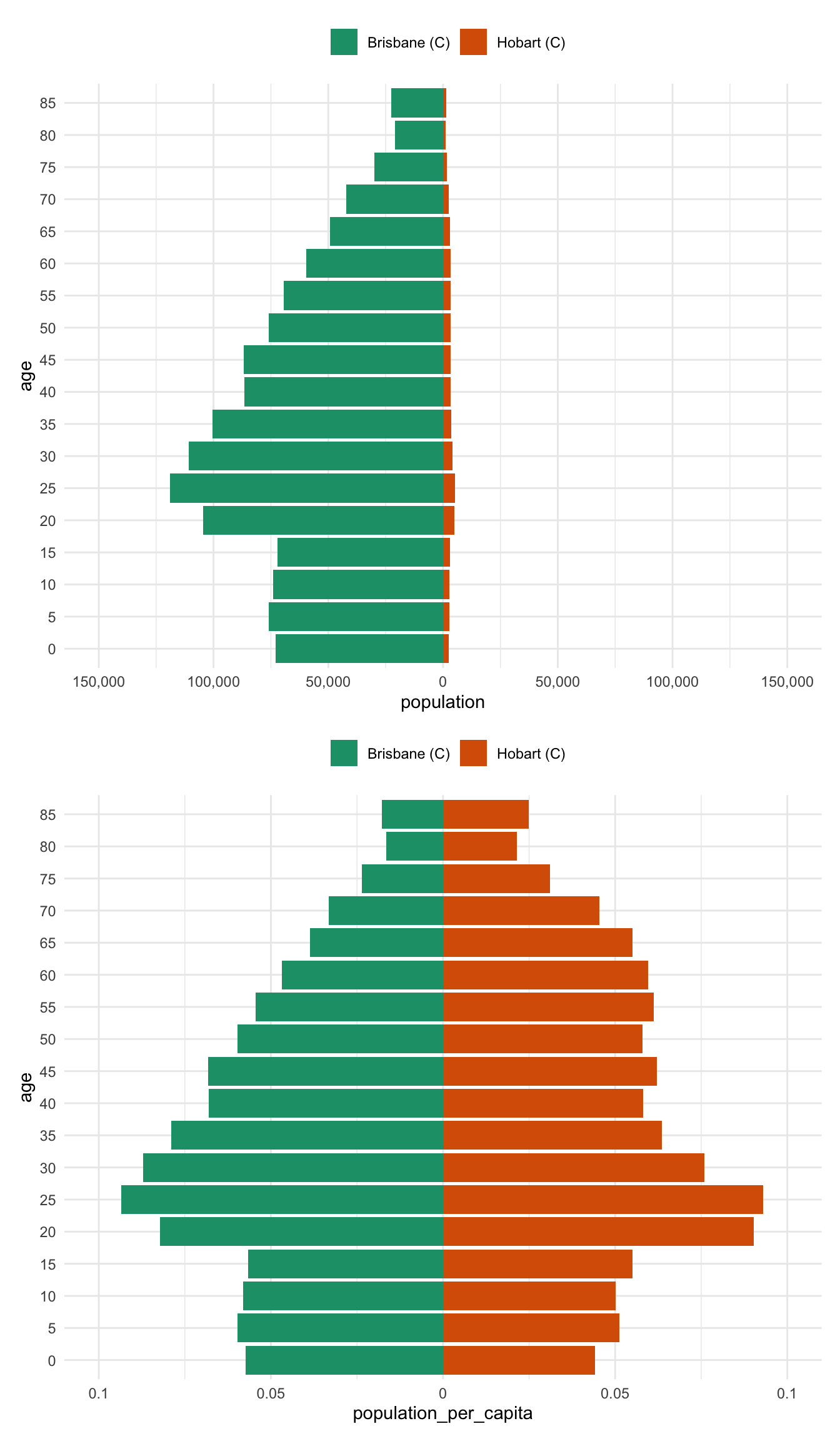
Another way to present this is as a regular bar graph, which more strongly places our focus on comparison between age groups.
bris_hobart_pyramid %>%
  mutate(
    # reverse age_multiplier
    population = case_when(
      age_multiplier == -1 ~ population * -1,
      TRUE ~ population
    ),
    population_per_capita = case_when(
      age_multiplier == -1 ~ population_per_capita * -1,
      TRUE ~ population_per_capita
    )
  ) %>%
  pivot_longer(
    cols = c(population,
             population_per_capita),
    names_to = "pop_type",
    values_to = "pop_value"
  ) %>%
  ggplot(aes(x = age,
             y = pop_value,
             fill = lga)) +
  geom_col(position = "dodge") +
  facet_wrap(~pop_type,
             scales = "free_y",
             ncol = 1) +
  scale_fill_brewer(
      palette = "Dark2",
      guide = guide_legend(
        title = ""
      )
    ) +
    theme_minimal() +
    theme(legend.position = "top")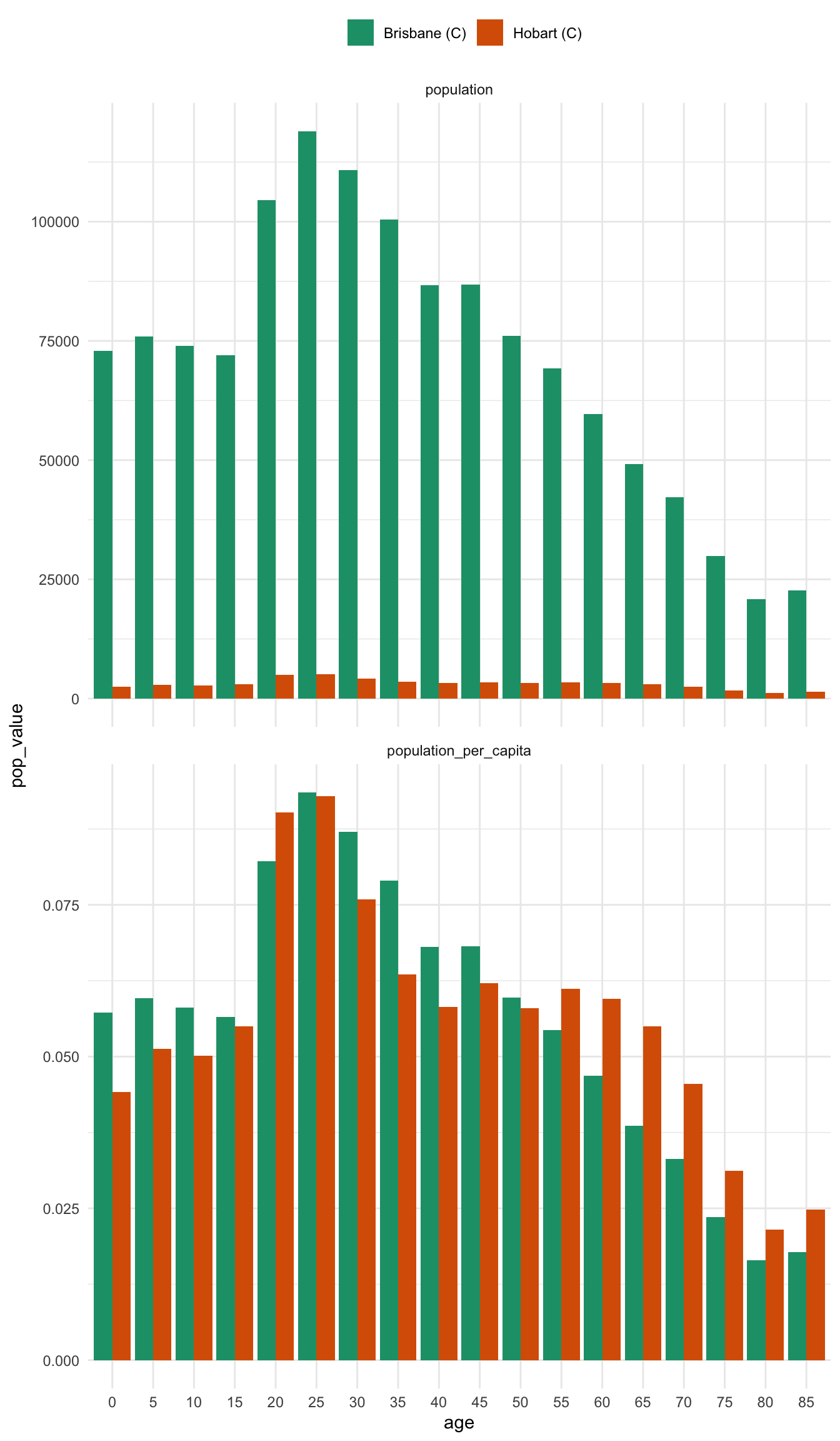
In some ways, I think I prefer this graph - there are many ways to present information, and in this case it helps us more clearly compare the differences between two places. It also strongly highlights the difference between using per capita and raw population values.
PS
I actually wrote this up initially to make a figure for a grant. Then, unhappy with the fact that I had to alter the code 2 times to make the figure, I converted it into a targets pipeline, which you can see here on github: https://github.com/njtierney/target-pop-pyramid
Also fun fact, the figure didn’t make it into the grant. But now you’ve got this blog post, so that’s pretty neat, I guess?